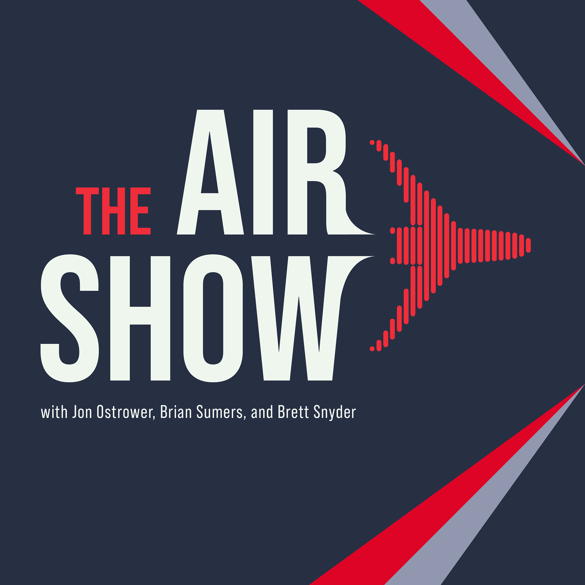

The client's goals for the designs was that they wanted something informative and easily readable, but didn't want it to feel too 'fun' as this podcast was geared towards those in the airline industry, not airline enthusiasts.
I started by creating some rough sketches and ideas to see what the client responded best to. I wanted to get a gauge on what motifs they seemed to like so I could understand their needs better.


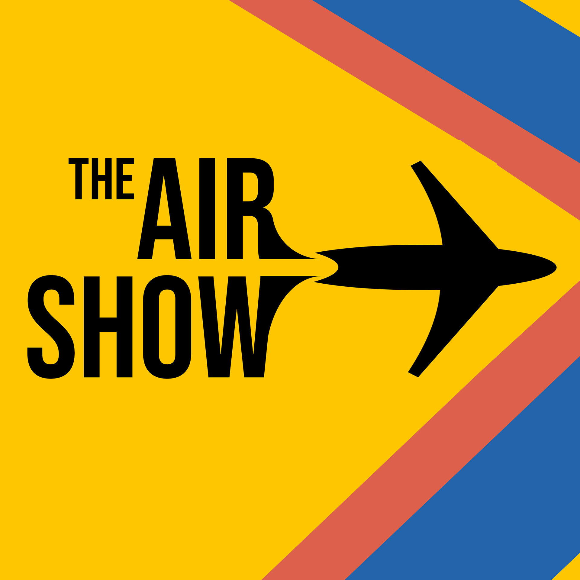

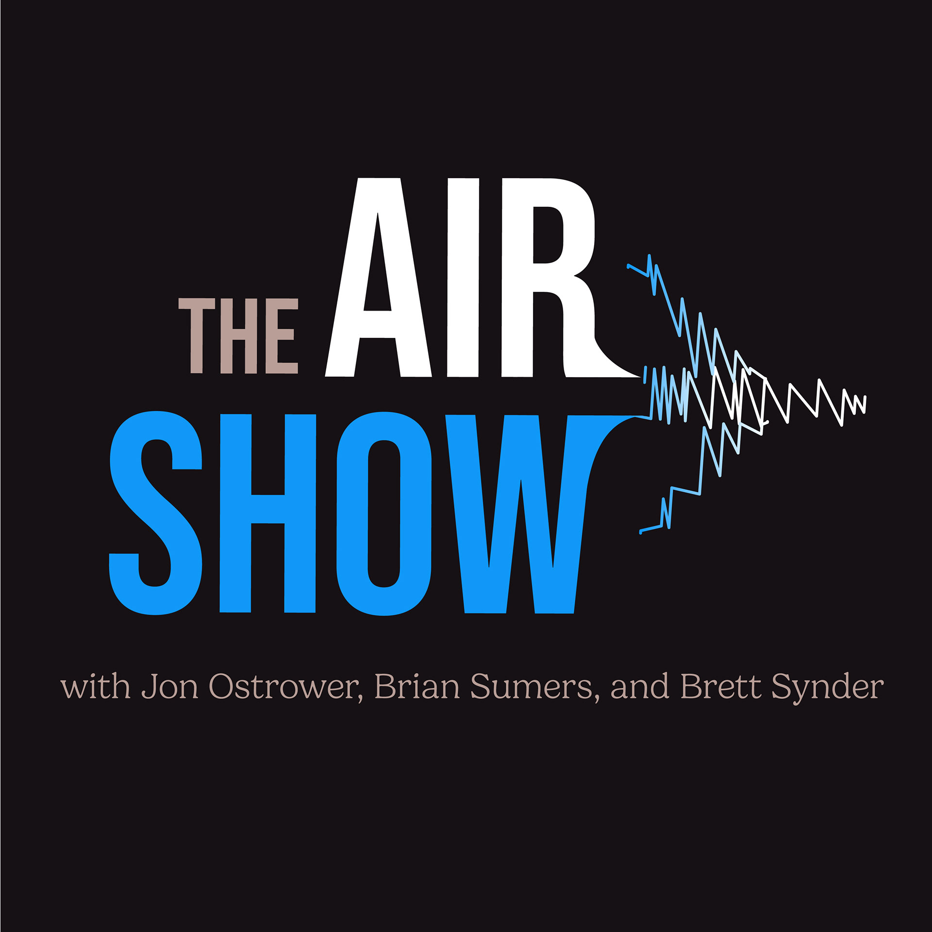
After these initial concepts, the client wanted to expand more upon the audio bars motif in design #4 as well as the letters leading into the airplane in designs 2 and 5. For the next round, I played with audio in both the bar format as well as a line format.


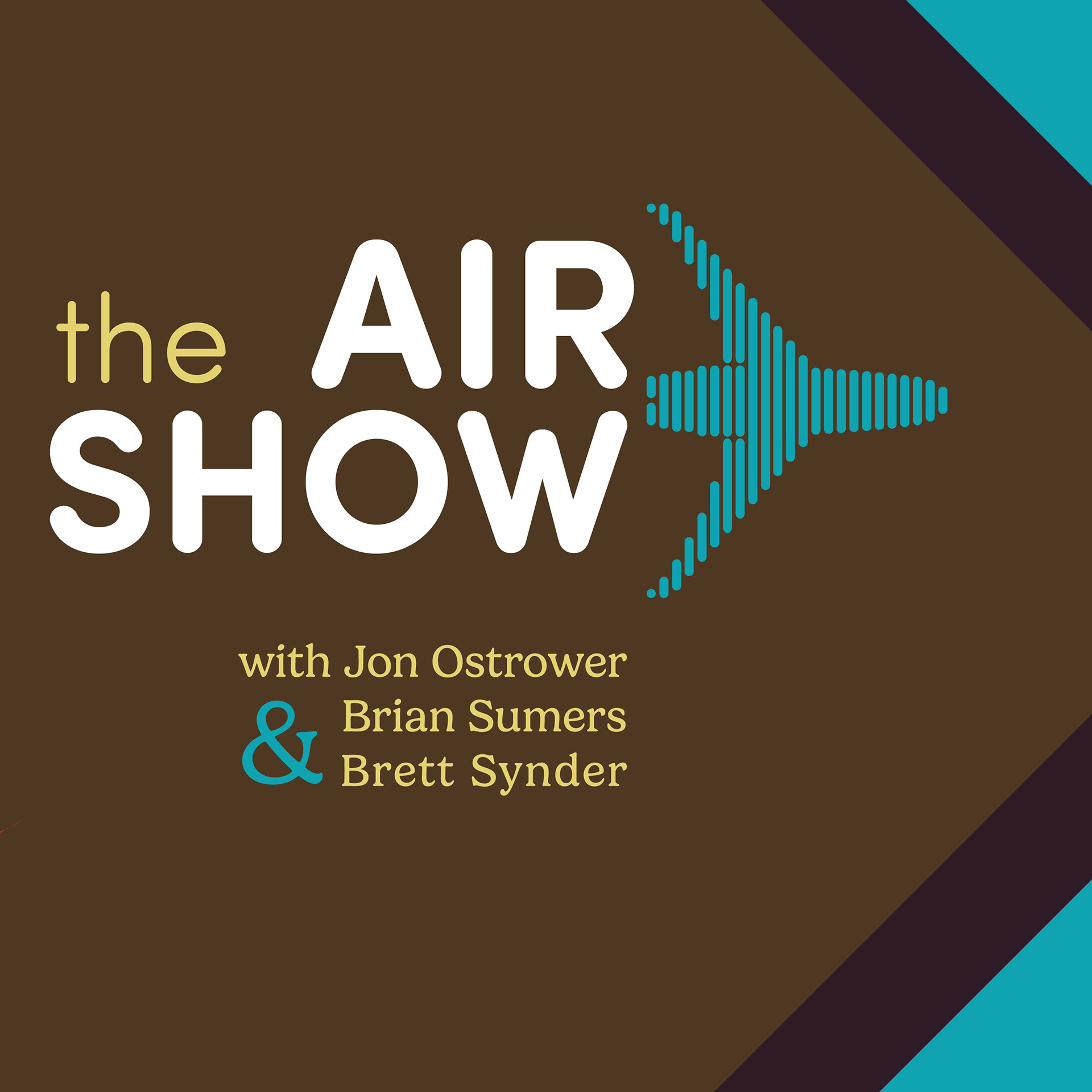

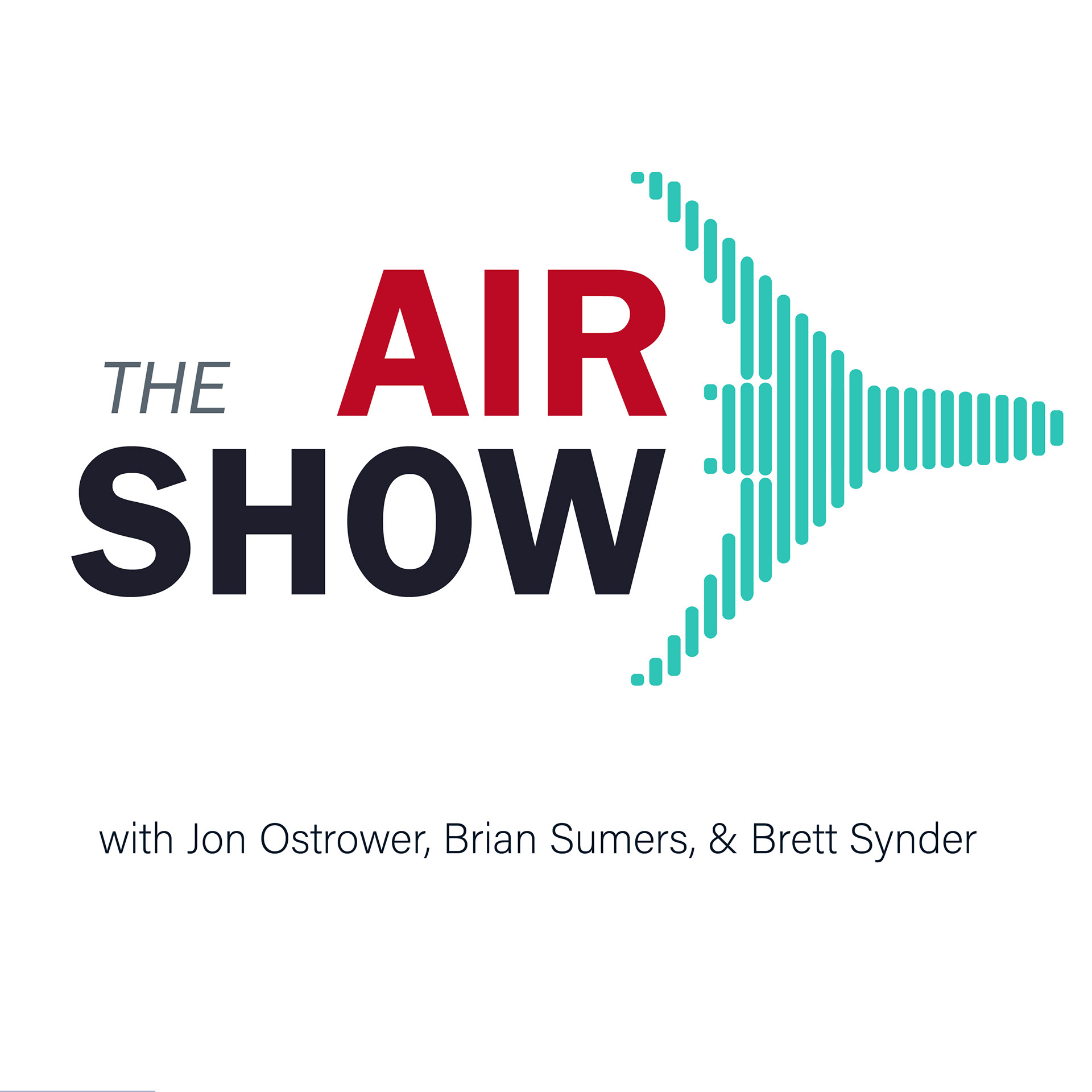

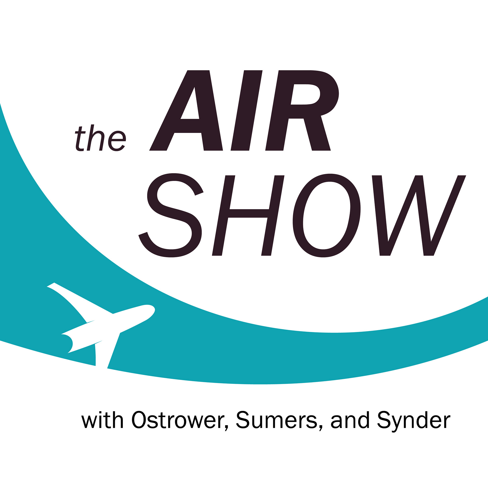
The client preferred design 8, so we moved onto color variations where I experimented with the font pairings further.

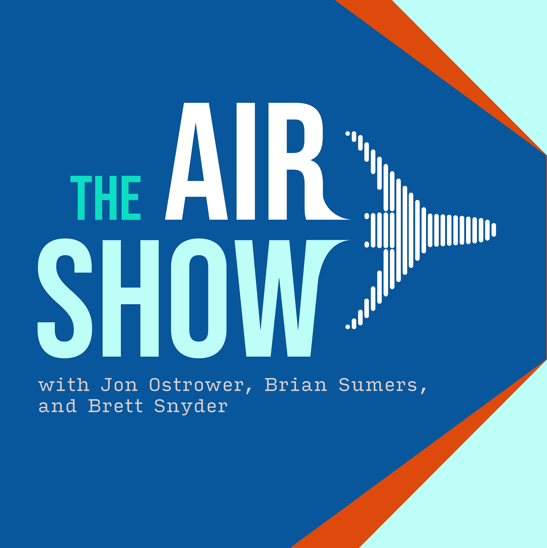


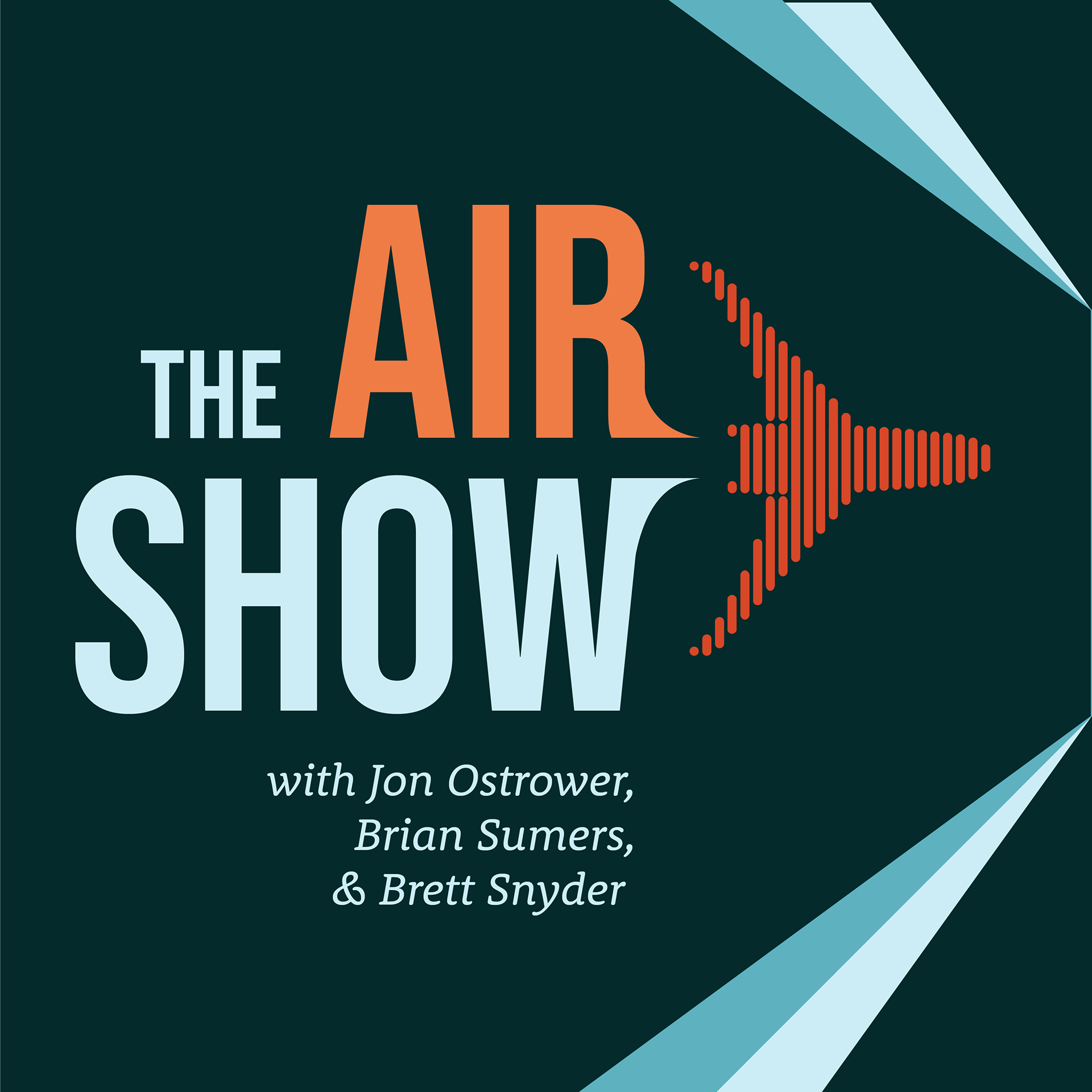
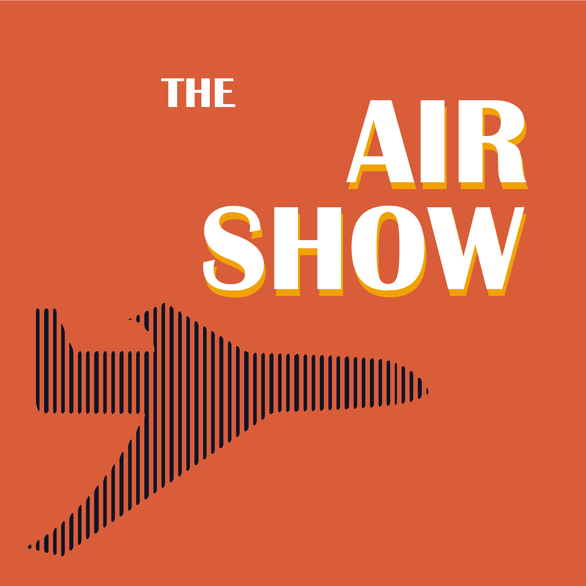
The client liked design 7. I adjusted the bottom font again for legibility, but then we had the final design!